Notes on responsive design testing
Testing your responsive design
With the built-in tools in Safari & Chrome, you can test your website’s responsive design and preview its effects on different device. Apart from the common aspect ratios such as 16:9 (For desktop/non-Apple tablets), 4:3 (iPad), ~20:9 (iPhone), some new aspect ratios for foldable phones could also take into consideration when coding your responsive design.
Testing Responsive Design on Chrome
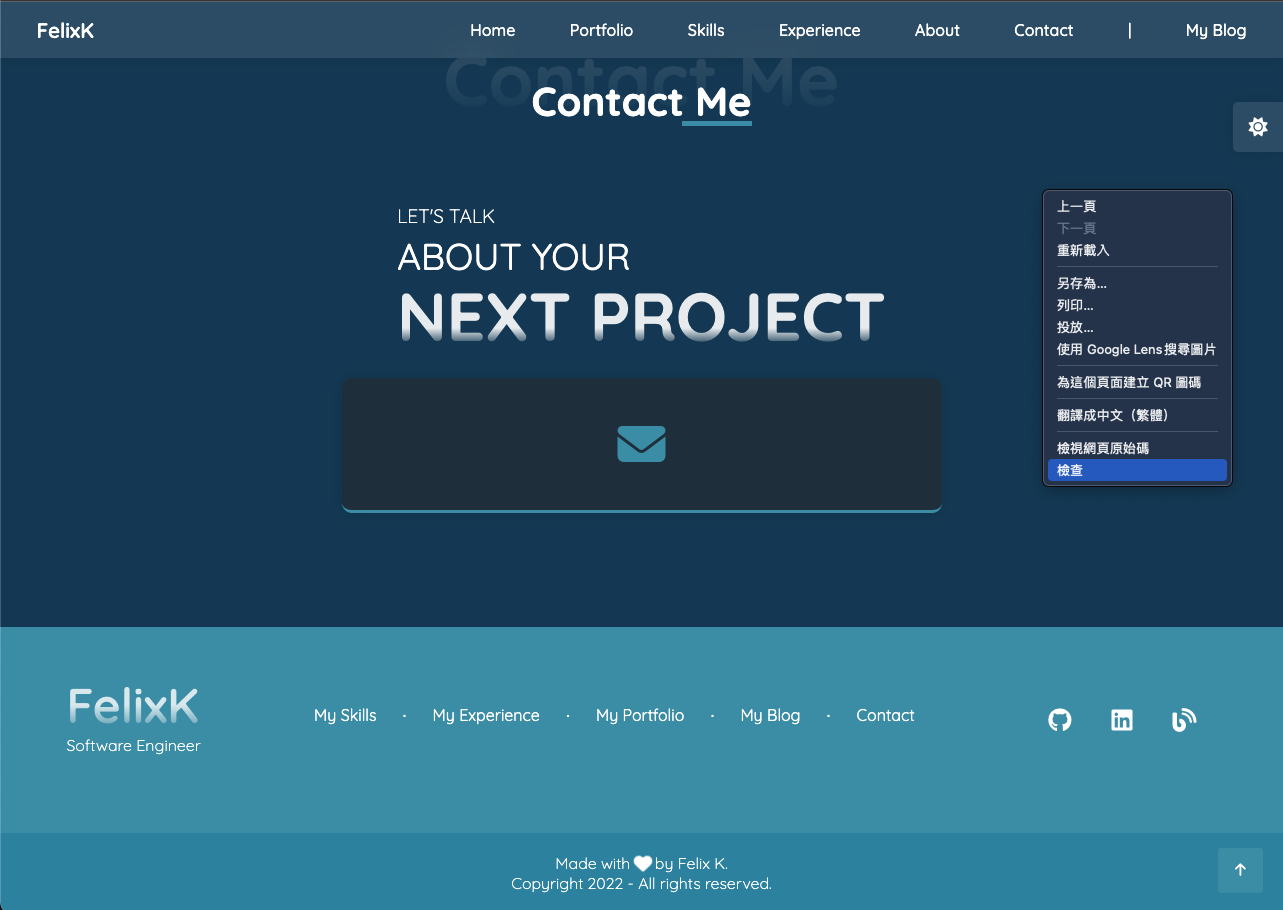
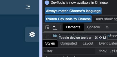
To test your design using Chrome you may simply hit F12 or right click anywhere on your webpage and hit inspect.
Click the icon beside the “Element” text label
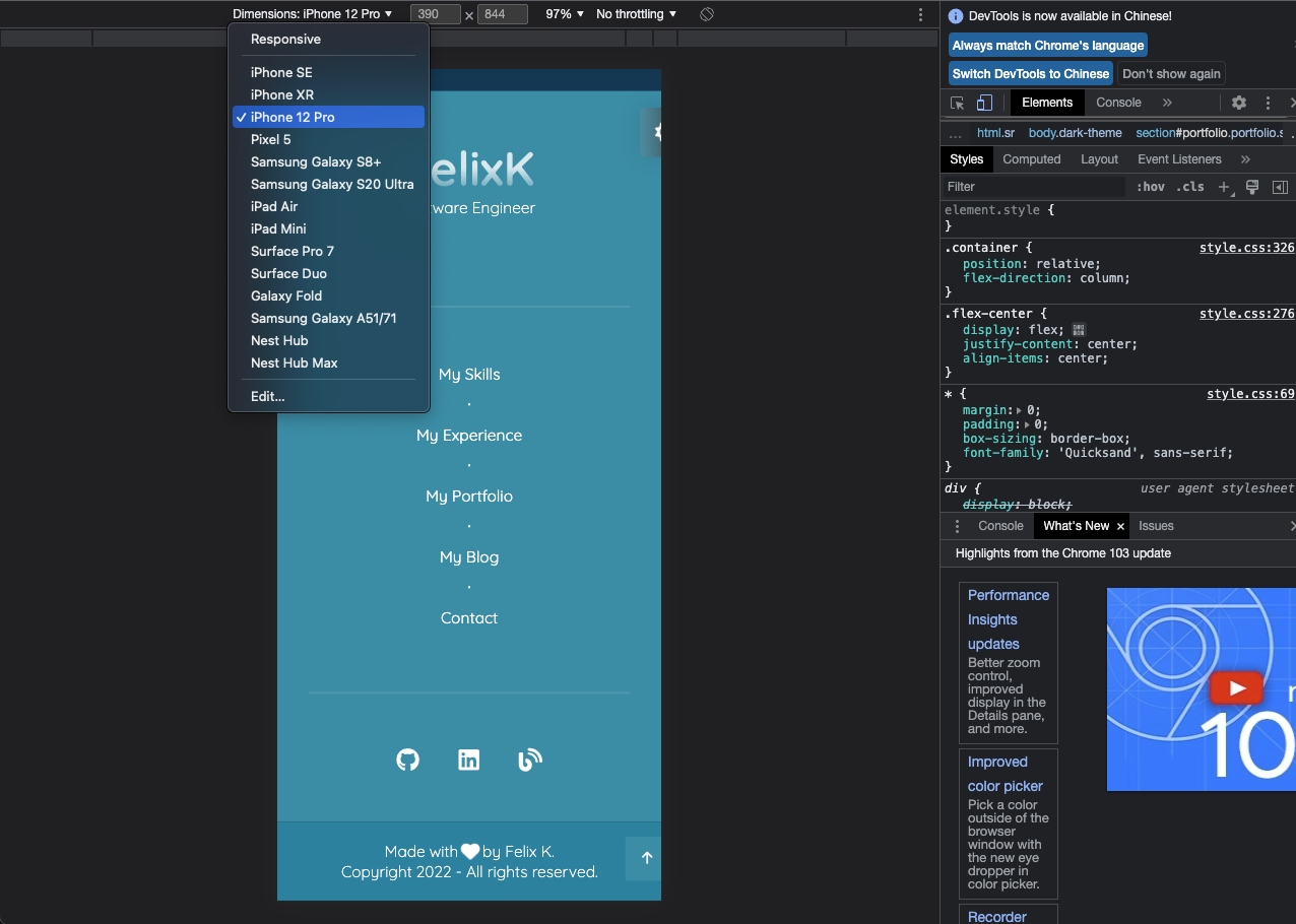
That’s it! You may now test out your design and choose the target device in the upper menu
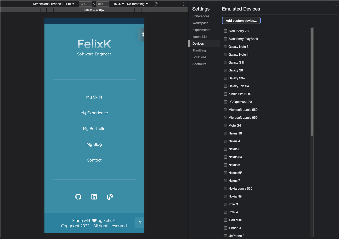
You may also add custom device for special aspect ratio
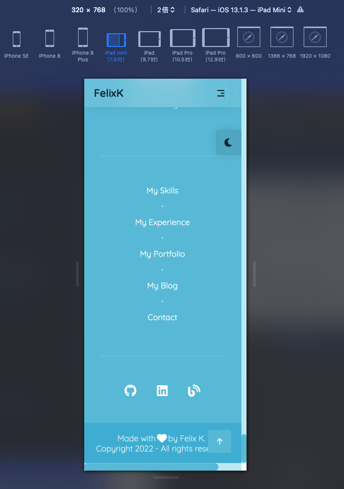
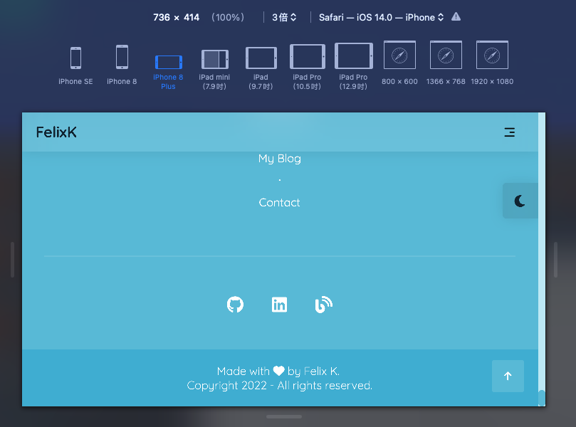
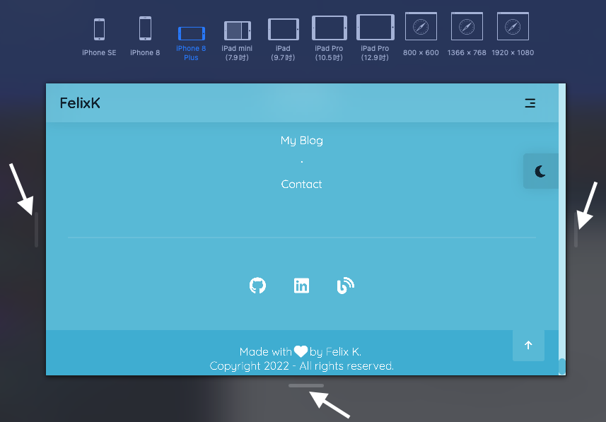
Testing Responsive Design on Safari
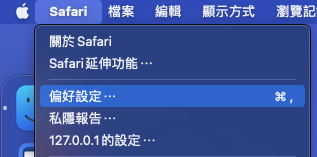
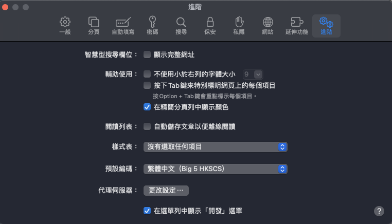
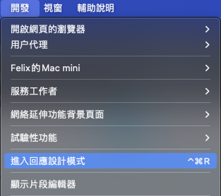
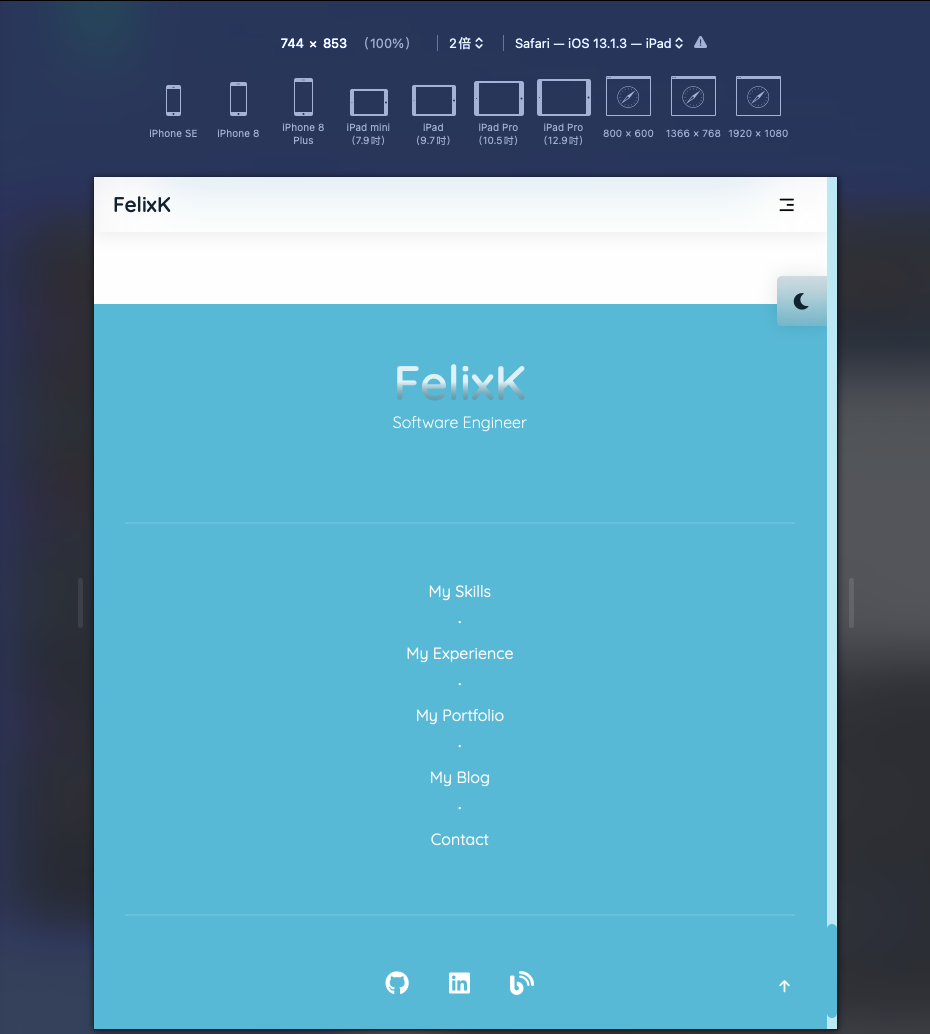
Testing on Safari is as simple as on Chrome with just extra few steps